O "capitalist" do título deve ser só provocação, pois os gráficos cobrem toda a humanidade, todos os regimes políticos, todos os sistemas econômicos, todas as épocas históricas.
Paulo Roberto de Almeida
|

|
|
|
|

|
|

|
|

|
|

|
|

|
|

|
|

|
|

|
O "capitalist" do título deve ser só provocação, pois os gráficos cobrem toda a humanidade, todos os regimes políticos, todos os sistemas econômicos, todas as épocas históricas.
Paulo Roberto de Almeida
|
|
|
|
|
|
|
|
|
|
|
|
|
|
|
|
|
|
|
|

The world’s (almost) eight billion people live under a wide variety of political and cultural circumstances. In broad terms, those circumstances can be measured and presented on a sliding scale between “free” and “not free”—the subtext being that democracy lies on one end, and authoritarianism on the other.
This year’s Democracy Index report by the Economist Intelligence Unit (EIU), is one such attempt to apply a score to countries based on how closely they measure up to democratic ideals.
According to EIU, the state of democracy is at its lowest point since the index began in 2006, blamed in part on the pandemic restrictions that saw many countries struggling to balance public health with personal freedom.
In this year’s report, the EIU reported a drop of the average global score from 5.37 to 5.28, the biggest drop since 2010 after the global financial crisis. This translates into a sobering fact: only 46% of the population is living in a democracy “of some sort.”
Let’s dive a bit deeper into what this means.
In 2021, 37% of the world’s population still lived under an authoritarian regime. Afghanistan tops this list, followed by Myanmar, North Korea, Democratic Republic of the Congo, and Syria. Of course, China has a big share of the population living under this style of regime.
On the other side of the spectrum we have full democracies, which only account for 6.4% of the population. Norway tops this list, followed by New Zealand, Finland, Sweden, and Iceland.
Let’s explore the characteristics of each of the four types of regime according to the EIU:
Full democracies are nations where:
Flawed democracies are nations where:
Hybrid regimes are nations where:
Authoritarian regimes are nations where:
As mentioned earlier, in 2021, the global democracy score declined from 5.37 to 5.28. This was driven by a decline in the average regional score, but every region has a different reality. Let’s take a look at the democratic state of each region in the world.
North America (Canada and U.S.) is the top-ranked region in the Democracy Index with an average score of 8.36, but this dropped significantly from 8.58 in 2020.
Both countries have dropped their positions in the global ranking, however, Canada still maintains the status as a full democracy.
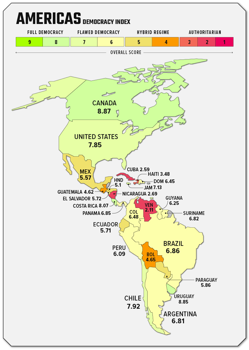
The U.S. is still classified by EIU as a flawed democracy, and has been since 2016. The report points to extreme polarization and “gerrymandering” as key issues facing the country. On the bright side, political participation in the U.S. is still very robust compared with the rest of the world.
Latin America and the Caribbean experienced the largest decline in regional scores in the world. This region dropped from 6.09 in 2020 to 5.83 in 2021. This decline shows the general discontent of the population about how their governments have handled the pandemic.
In this region, the only country that falls under a full democracy is Costa Rica. On the other side of the spectrum, Venezuela, Nicaragua, and Cuba fall under the authoritarian regime classification.
In 2021, Western Europe is the region with the most full democracies in the world.
In fact, four out of the top five full democracies are in this region: Norway, Finland, Sweden, and Iceland. A notable downgrade in this region happened in Spain; the country is now considered a flawed democracy.
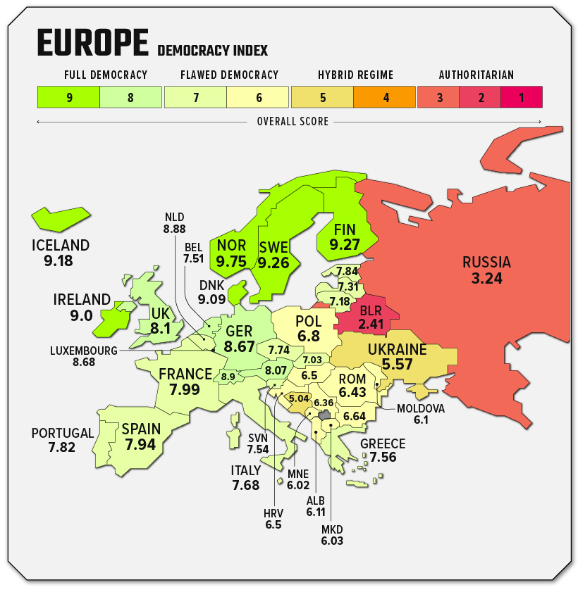
Eastern Europe paints a different picture, where there is not a single full democracy. Three countries (Moldova, Montenegro, and North Macedonia) were upgraded from being considered hybrid regimes to flawed democracies.
Ukraine’s score declined to 5.57, becoming a hybrid region. Russia’s score also declined to 3.24 keeping the authoritarian regime status. It’s important to note that this report by the EIU was published before the invasion of Ukraine began, and the conflict will almost certainly impact scores in next year’s report.
Sub-Saharan Africa has the most countries at the bottom of the Democracy Index rankings.
The fact is that 23 countries are considered “authoritarian regimes”. Meanwhile, there are 14 countries that are hybrid regimes, six countries under flawed democracy, and only one country, Mauritius, is considered a full democracy.
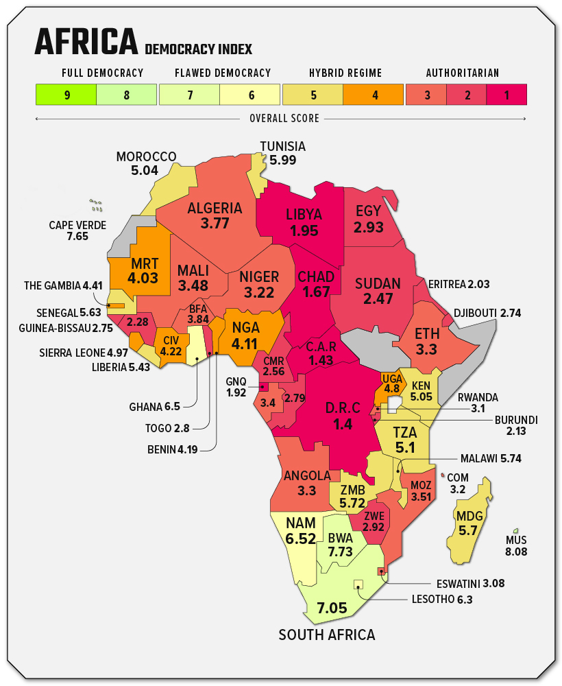
In North Africa, four countries are considered authoritarian regimes: Sudan, Egypt, Libya, and Algeria. Only Morocco and Tunisia fall into the hybrid regime classification.
This region concentrates a substantial number of countries classified as authoritarian regimes. In fact, the region’s overall democracy score is now lower than what it was before the start of the Arab Spring in 2010.
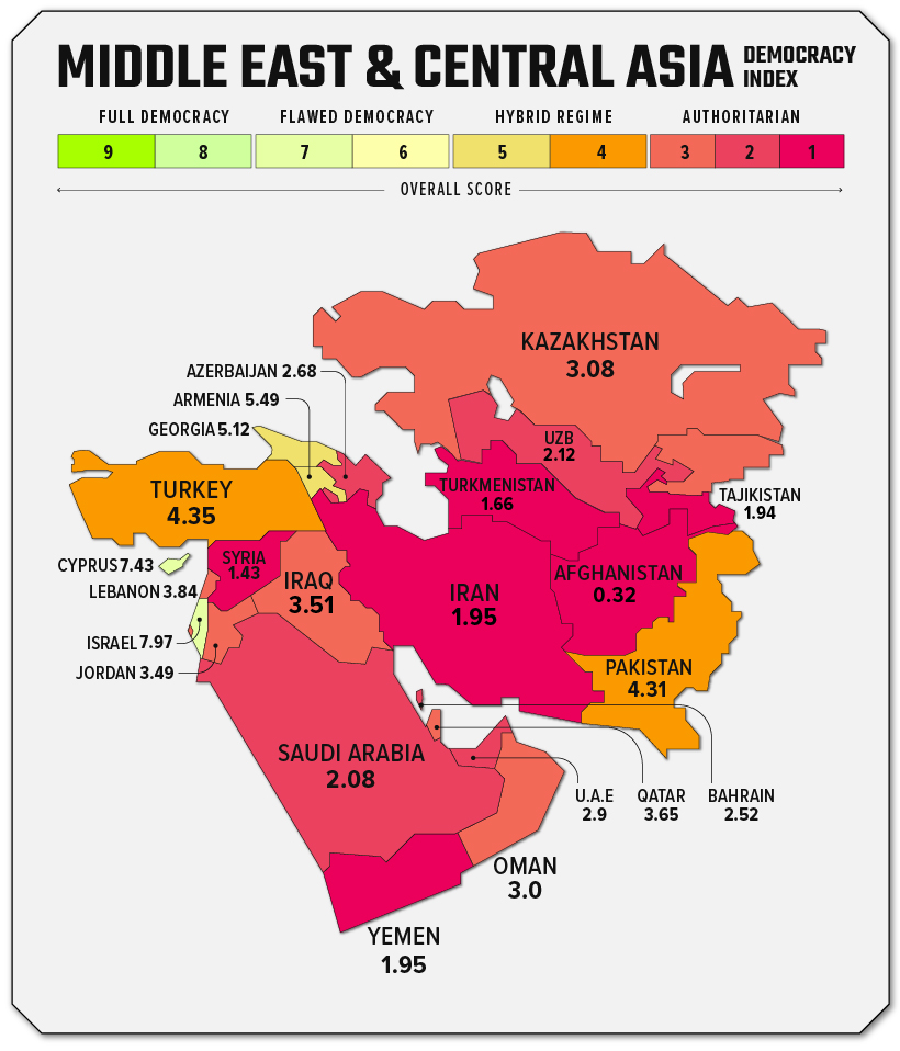
There are no countries falling under the category of full democracy in this region. Only Israel (7.97) and Cyprus (7.43) are considered flawed democracies. Turkey, Georgia, Armenia, and Pakistan fall under the category of hybrid regimes, and the rest of the countries in the region are considered authoritarian regimes.
This is broad region is full of contrasts. Aside from Western Europe, East Asia and Oceania contains the most full democracies: New Zealand, Taiwan, Australia, South Korea, and Japan. There are also a high number of countries that fall under the category of flawed democracies.
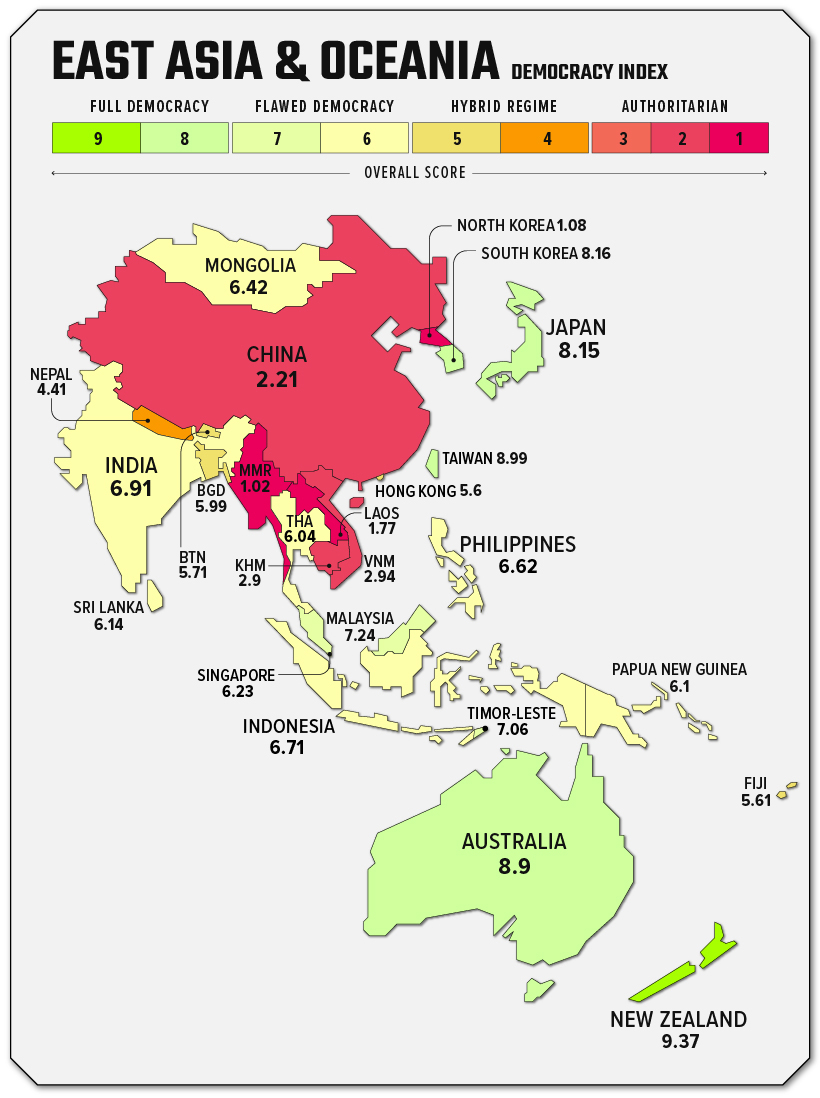
It’s worth noting that some of the most contentious geopolitical relationships are between neighbors with big differences in their scores: China and Taiwan, or North and South Korea are examples of this juxtaposition.
Two years after the world got hit by the pandemic, we can see that global democracy is in a downward trend.
Every region’s global score experienced a drop, with the exception of Western Europe, which remained flat. Out of the 167 countries, 74 (44%) experienced a decline in their democracy score.
As pandemic restrictions continue to be lifted, will democracy make a comeback in 2022?
The European Union (EU) is a unique economic and political union between 27 European countries.
First created as the European Economic Community in the aftermath of WW2, the organization’s main focus was to foster economic cooperation. The idea was simple: countries that trade with one another and become economically interdependent are more likely to avoid conflict.
Beginning with six countries in 1958, the European Economic Community has since added 21 more countries (the UK left the EU in 2020), with a primary focus on single or internal markets.
Here are the countries that comprise the European Union:
Here are the countries that comprise the European Union:
11 | Germany | Founder |
| 12 | Greece | 1985 |
| 13 | Hungary | 2004 |
| 14 | Ireland | 1973 |
| 15 | Italy | Founder |
| 16 | Latvia | 2004 |
| 17 | Lithuania | 2004 |
| 18 | Luxembourg | Founder |
| 19 | Malta | 2004 |
| 20 | Netherlands | Founder |
| 21 | Poland | 2004 |
| 22 | Portugal | 1986 |
| 23 | Romania | 2007 |
| 24 | Slovakia | 2004 |
| 25 | Slovenia | 2004 |
| 26 | Spain | 1986 |
| 27 | Sweden | 1995 |

As of 2021, NATO officially recognizes three aspiring NATO members: Bosnia and Herzegovina, Georgia, and Ukraine. Ukraine has voiced its desire to join NATO since 2014 but hasn’t met its political and military criteria.
The eurozone is a geographic and economic region that consists of countries that have adopted the euro as their national currency. Approximately 340 million people live in the euro area.
Today, the eurozone consists of 19 countries of the European Union. Here they are:
| 1 | Austria | 1999 |
| 2 | Belgium | 1999 |
| 3 | Cyprus | 2008 |
| 4 | Estonia | 2011 |
| 5 | Finland | 1999 |
| 6 | France | 1999 |
| 7 | Germany | 1999 |
| 8 | Greece | 2001 |
| 9 | Ireland | 1999 |
| 10 | Italy | 1999 |
| 11 | Latvia | 2014 |
| 12 | Lithuania | 2015 |
| 13 | Luxembourg | 1999 |
| 14 | Malta | 2008 |
| 15 | Netherlands | 1999 |
| 16 | Portugal | 1999 |
| 17 | Slovakia | 2009 |
| 18 | Slovenia | 2007 |
| 19 | Spain | 1999 |
The eyes of the world are now fixed on the Russian invasion of Ukraine.
The motivations of Russia’s president, Vladimir Putin, are now the biggest unanswered question of this geopolitical event. One prominent line of thinking is that Putin is looking to reclaim the territory lost after the dissolution of the Union of Soviet Socialist Republics (USSR), and the Russian leader’s own words appear to support this claim:
Ukraine is not just a neighboring country for us. It is an inalienable part of our own history, culture and spiritual space. Since time immemorial, the people living in the south-west of what has historically been Russian land have called themselves Russians.
The disintegration of our united country was brought about by the historic, strategic mistakes on the part of Bolshevik and Soviet leaders […] the collapse of the historical Russia known as the USSR is on their conscience.
For anyone born after the 1970s, memories of that era range from hazy to non-existent, so it’s worth answering the question: What was the USSR anyway?
Below, we’ll use historical maps from three specific eras to build context for how the USSR was structured, which modern countries were a part of this sprawling country, and how its history relates to Russia’s present day pushes for territorial expansion.
Let’s dive in.
The USSR was first born in 1922, in the aftermath of the fallen Russian Empire. A civil war between the Bolshevik Red Army and anti-Bolshevik forces across the region ended with the former coming out victorious. This resulted in the unification of a number of republics to form the Soviet Union.
After a number of tumultuous years during the reign of Joseph Stalin, which include a devastating famine which killed millions of people, we arrive at our first snapshot in time: the late 1930s.
For more detail, view the full-sized version of this map
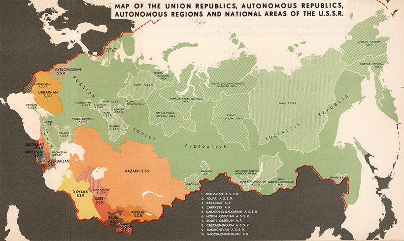
The USSR was set up as a federation of constituent union republics, which were either unitary states, such as Ukraine, or federations, such as Russia.
Below, we can see how this organizational structure was laid out.

For more detail, view the full-sized version of this diagram
While nominally a union of equals, in practice the Soviet Union was dominated by the Russian Republic (RSFSR). This massive republic contained most of the country’s economic and political power, as well as the largest population and landmass. As shown below, its borders weren’t vastly different from the modern day Russian Federation.

For more detail, view the full-sized version of this map
The geopolitical history of the USSR is inexorably bound with territorial disputes with neighboring regions. In the map above, from 1938, we can see that Soviet troops are clashing with Japan on the eastern edge of the country. On the other end, Stalin had annexed half of Poland, the three Baltic States, and portions of Romania, following the pact with Adolf Hitler.
This sequence of events set the stage for World War II.
The USSR achieved victory in WWII, but at a great cost. An estimated 14% of the prewar population perished in the conflict.
By the end of the 1950s though, the Soviet Union was riding high on a string of impressive achievements on the world stage, from launching the first satellite into space to developing missiles that were a credible threat to American cities. As well, the country’s GDP growth was outpacing its Cold War rival.
This map is a snapshot of the USSR just prior to the construction of the Berlin Wall in 1962.

For more detail, view the full-sized version of this map
Above, in orange, we see how much territory the USSR ended up with after the war. This map is especially informative as it lists the populations of the territories at the time. Large portions of Eastern Europe—including more than 22 million people—were rolled behind the iron curtain.
After a prolonged period of stagnation, Mikhail Gorbachev attempted to reform the Soviet political and economic system with perestroika, which literally translates to “reconstruction”. This movement began a slow process of democratization that eventually destabilized Communist control through the late 1980s, hastening the collapse of the Soviet Union.
The map below is a snapshot of the USSR two years prior to its official dissolution in 1991.
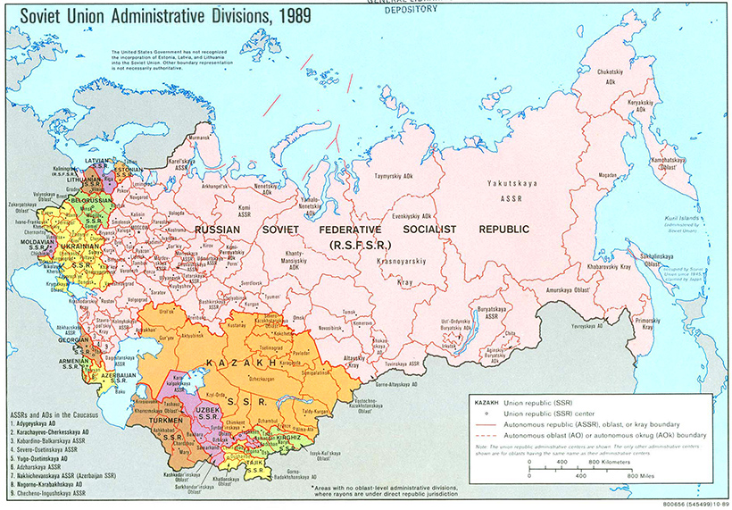
For more detail, view the full-sized version of this map
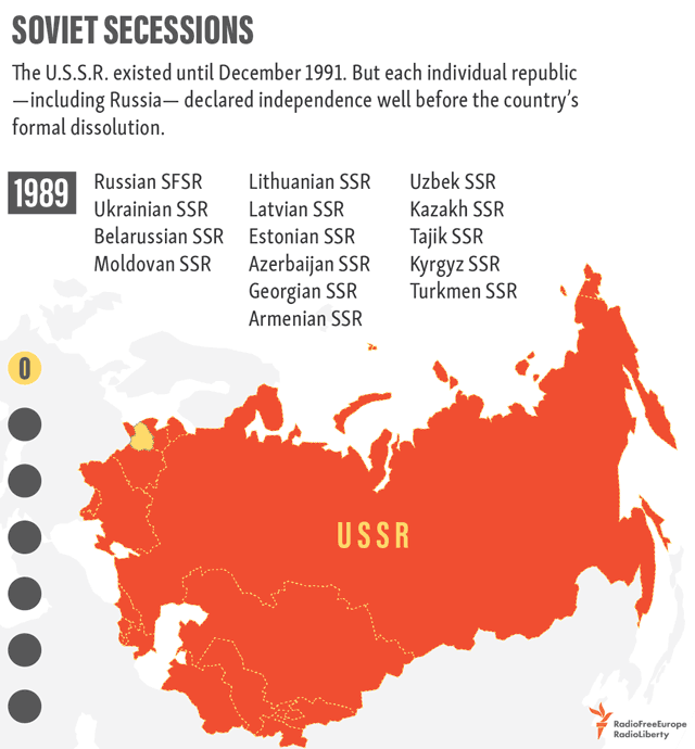
Many of the republics, shown in various colors above, were already seeing independence movements and unrest by this time, and would eventually declare independence one by one.
Here’s a list of the major regions that seceded from the USSR:
| USSR Subdivision | Present Day Country | Seceded from the USSR |
|---|---|---|
| Estonian SSR |  Estonia Estonia | 8 May 1990 |
| Lithuanian SSR |  Lithuania Lithuania | 11 March 1990 |
| Latvian SSR |  Latvia Latvia | 4 May 1990 |
| Azerbaijan SSR |  Azerbaijan Azerbaijan | 30 August 1991 |
| Georgian SSR |  Georgia Georgia | 9 April 1991 |
| Russian SFSR |  Russian Federation Russian Federation | 12 December 1991 |
| Uzbek SSR |  Uzbekistan Uzbekistan | 31 August 1991 |
| Moldavian SSR |  Moldova Moldova | 27 August 1991 |
| Ukrainian SSR |  Ukraine Ukraine | 24 August 1991 |
| Byelorussian SSR |  Belarus Belarus | 10 December 1991 |
| Turkmen SSR |  Turkmenistan Turkmenistan | 27 October 1991 |
| Armenian SSR |  Armenia Armenia | 21 September 1991 |
| Tajik SSR |  Tajikistan Tajikistan | 9 September 1991 |
| Kazakh SSR |  Kazakhstan Kazakhstan | 16 December 1991 |
| Kirghiz SSR |  Kyrgyzstan Kyrgyzstan | 31 August 1991 |
Since these regions seceded with their borders largely intact, a current map of this part of the world doesn’t look too different from the one above.
That said, even as borders remain static, the war in Ukraine demonstrates that power dynamics in this region are still very much in flux.
Excepcional: How the European Map Has Changed Over 2,400 Years
The history of Europe is breathtakingly complex. While there are rare exceptions like Andorra and Portugal, which have had remarkably static borders for hundreds of years, jurisdiction over portions of the continent’s landmass have changed hands innumerable times.
Today’s video comes to us from YouTube channel Cottereau, and it shows the evolution of European map borders starting from 400 BC. Empires rise and fall, invasions sweep across the continent, and modern countries slowly begin to take shape (with the added bonus of an extremely dramatic instrumental).
Below are nine highlights and catalysts that shifted the dividing lines of the European map:
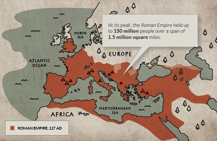
146 BC was a year of conquest and expansion for the Roman Republic. The fall of Carthage left the Romans in control of territory in North Africa, and the ransack and destruction of the Greek city-state of Corinth also kickstarted an era of Roman influence in that region. These decisive victories paved the way for the Roman Empire’s eventual domination of the Mediterranean.
The peak of the Roman Empire is one of the more dramatic moments shown on this animated European map. At its height, under Trajan, the Roman Empire was a colossal 1.7 million square miles (quite a feat in an era without motorized vehicles and modern communication tools). This enormous empire remained mostly intact until 395, when it was irreparably split into Eastern and Western regions.
Spurred on by severe drought conditions in Central Asia, the Huns reached Europe and found a Roman Empire weakened by currency debasement, economic instability, overspending, and increasing incursions from rivals along its borders.
The Huns waged their first attack on the Eastern Roman Empire in 395, but it was not until half a century later—under the leadership of Attila the Hun—that hordes pushed deeper into Europe, sacking and razing cities along the way. The Romans would later get their revenge when they attacked the quarreling Goths and Huns, bouncing the latter out of Central Europe.
In the mid-13th century, the “Golden Horde” led by grandsons of Genghis Khan, roared into Russia and Eastern Europe sacking cities along the way. Facing invasion from formidable Mongol forces, central European princes temporarily placed their regional conflicts aside to defend their territory. Though the Mongols were slowly pushed eastward, they loomed large on the fringes of Europe until almost the 16th century.
Today, Lithuania is one of Europe’s smallest countries, but at its peak in the middle ages, it was one of the largest states on the continent. A pivotal moment for Lithuania came after a decisive win at the Battle of Blue Waters. This victory stifled the expansion of the Golden Horde, and brought present-day Ukraine into its sphere of influence.
The end of the Holy Roman Empire highlights the extreme territorial fragmentation in Germany and neighboring regions, in an era referred to as Kleinstaaterei.
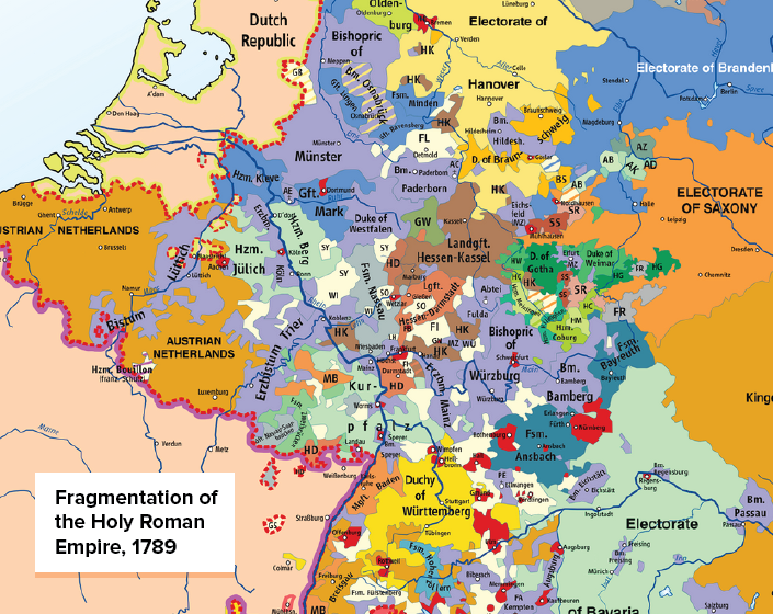
Even as coherent nation states formed around it, the Holy Roman Empire and its remnants wouldn’t coalesce until Germany rose from the wreckage of the Franco-Prussian War in 1871. Unification helped position Germany as a major power, and by 1900 the country had the largest economy in Europe.
The Ottoman Empire—a fixture in Eastern Europe for hundreds of years—was in its waning years by the beginning of the 20th century. The empire had ceded territory in two costly wars with Italy and Balkan states, and by the time the dust cleared on WWI, the borders of the newly minted nation of Turkey began at the furthest edge of continental Europe.
At the furthest extent of Axis territory in World War II, Germany and Italy controlled a vast portion of continental Europe. The map below shows occupied land and areas of influence at the height of Germany’s territorial expansion.
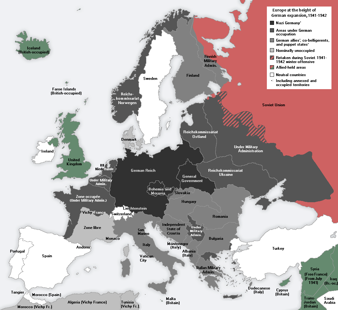
After the war, Germany again became fragmented into occupation zones—this time, overseen by the United States, France, Great Britain, and the Soviet Union. Germany would not be made whole again until 1990, when a weakening Soviet Union loosened its grip on East Germany.
In the decades following WWII, the political boundaries of the European map remained relatively stable—that is, until the dissolution of the Soviet Union in 1991. Almost overnight, the country’s entire western border splintered into independent nations. When the dust settled, there were 15 breakaway republics, six of which were in Europe.
Bonus: If you liked the video above, be sure to watch this year-by-year account of who ruled territories across Europe.
Visualizing 50+ Years of the G20’s Energy Mix
Over the last 50 years, the energy mix of G20 countries has changed drastically in some ways.
With many countries and regions pledging to move away from fossil fuels and towards cleaner sources of energy, the overall energy mix is becoming more diversified. But shutting down plants and replacing them with new sources takes time, and most countries are still incredibly reliant on fossil fuels.
This video from James Eagle uses data from BP’s Statistical Review of World Energy to examine how the energy mix of G20 members has changed from 1965 to 2019.
At first, there was oil and coal.
From the 1960s to the 1980s, energy consumption in the G20 countries relied almost entirely on these two fossil fuels. They were the cheapest and most efficient sources of energy for most, though some countries also used a lot of natural gas, like the United States, Mexico, and Russia.
| Country (Energy Mix - 1965) | Oil | Coal | Other |
|---|---|---|---|
 Argentina Argentina | 83% | 3% | 14% |
 Australia Australia | 45% | 50% | 5% |
 Brazil Brazil | 66% | 8% | 26% |
 Canada Canada | 47% | 13% | 40% |
 China China | 8% | 87% | 5% |
 EU EU | 47% | 45% | 8% |
 France France | 49% | 37% | 14% |
 Germany Germany | 34% | 63% | 3% |
 India India | 24% | 67% | 9% |
 Indonesia Indonesia | 86% | 2% | 12% |
But the use of oil for energy started to decrease, beginning most notably in the 1980s. Rocketing oil prices forced many utilities to turn to coal and natural gas (which were becoming cheaper), while others in countries like France, Japan, and the U.S. embraced the rise of nuclear power.
This is most notable in countries with high historic oil consumption, like Argentina and Indonesia. In 1965, these three countries relied on oil for more than 83% of energy, but by 1999, oil made up just 55% of Indonesia’s energy mix and 36% of Argentina’s.
Even Saudi Arabia, the world’s largest oil exporter, began to utilize oil less. By 1999, oil was used for 65% of energy in the country, down from a 1965 high of 97%.
The conversation around energy changed in the 21st century. Before, countries were focused primarily on efficiency and cost, but very quickly, they had to start contending with emissions.
Climate change was already on everyone’s radar. The UN Framework Convention on Climate Change was signed in 1992, and the resulting Kyoto Protocol aimed at reducing greenhouse gas emissions was signed in 1997.
But when the Kyoto Protocol went into effect in 2005, countries had very different options available to them. Some started to lean more heavily on hydroelectricity, though countries that already utilized them like Canada and Brazil had to look elsewhere. Others turned to nuclear power, but the 2011 Fukushima nuclear disaster in Japan turned many away.
This is the period of time that renewables started to pick up steam, primarily in the form of wind power at first. By 2019, the G20 members that relied on renewables the most were Brazil (16%), Germany (16%), and the UK (14%).
However, the need to reduce emissions quickly made many countries make a simpler switch: cut back on oil and coal and utilize more natural gas. Bituminous coal, one of the most commonly used in steam-electric power stations, emits 76% more CO₂ than natural gas. Diesel fuel and heating oil used in oil power plants emit 38% more CO₂ than natural gas.
As countries begin to push more strongly towards a carbon-neutral future, the energy mix of the 2020s and onward will continue to change.
